

Always be iterating and looking to improve your site's experience for your users. Sometimes designs need to be audited to see how they are truly performing and how your users are interacting with your site + products. On ConsumerAffairs, all of the Buyer's Guide page types cover a specific topic and provide everything a person in the market needs to know about that specific topic — everything from top brands, actual customer reviews, and educational content. This is a compilation of UX improvements made in phases to the Buyer's Guide template that were driven by digging into the data.
At the beginning of this project, this Buyer's Guide template was one long simple white template and the data was showing a higher bounce rate even though it had good content and information for the people coming to the page.
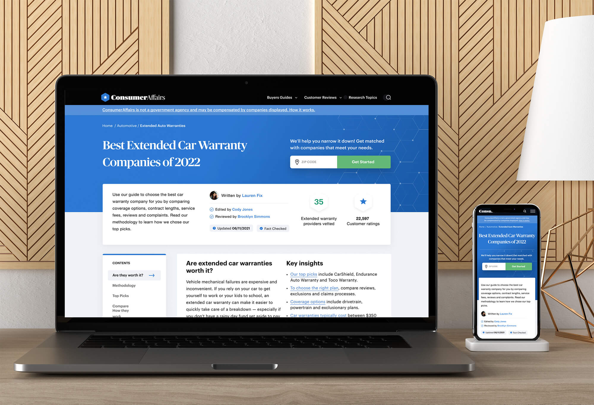
The first step in helping this template was to add in trust factors section to the top of the page to show it's been updated recently and the content was facted checked. After adding in those trust factors, ConsumerAffairs saw a drop in bounce rate and an increase in scroll depth on these page types.
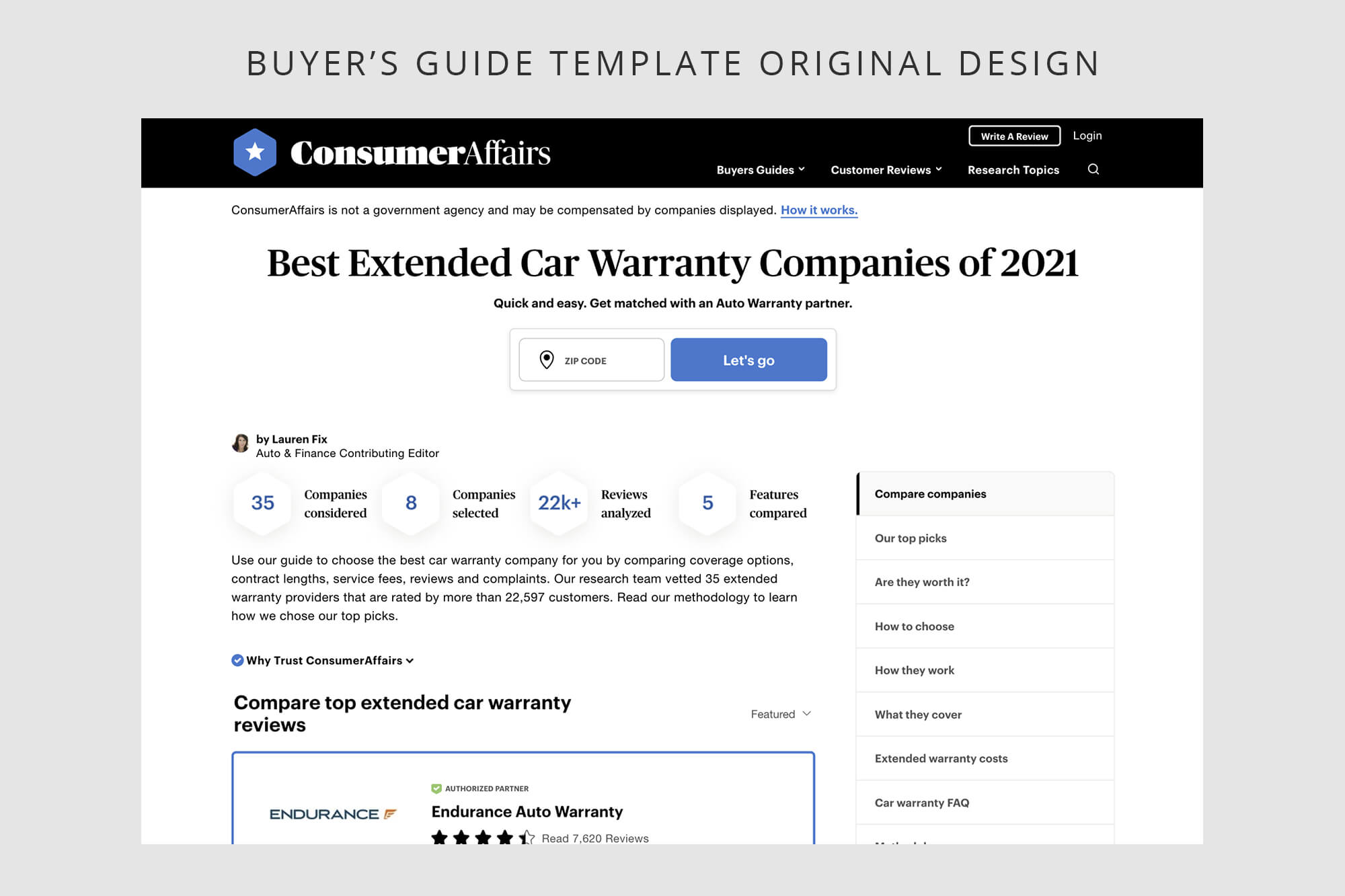
The original design of this template had a zipcode field CTA at the center of the hero that would take users into a tool to help them get matched to the companies that best fit their needs. At the surface level, this CTA actually looked like it was getting a lot of traffic. However, after a deeper look into the data, I found that a high percentage of people were immediately bouncing from the matching tool landing page. Due to the original placement of the CTA and the copy, it became clear that people thought it would filter the page to provide information based on their area. To help fix the user experience of the page, I adjusted the design of the hero to move the CTA off to the right and changed the copy to provide more context about where a user would go if they engaged with this CTA. After a month long A/B test, I found that less people were clicking into the hero CTA — however the people who did, actually moved forward with the matching tool experience and there was significatlly less bounce rate.
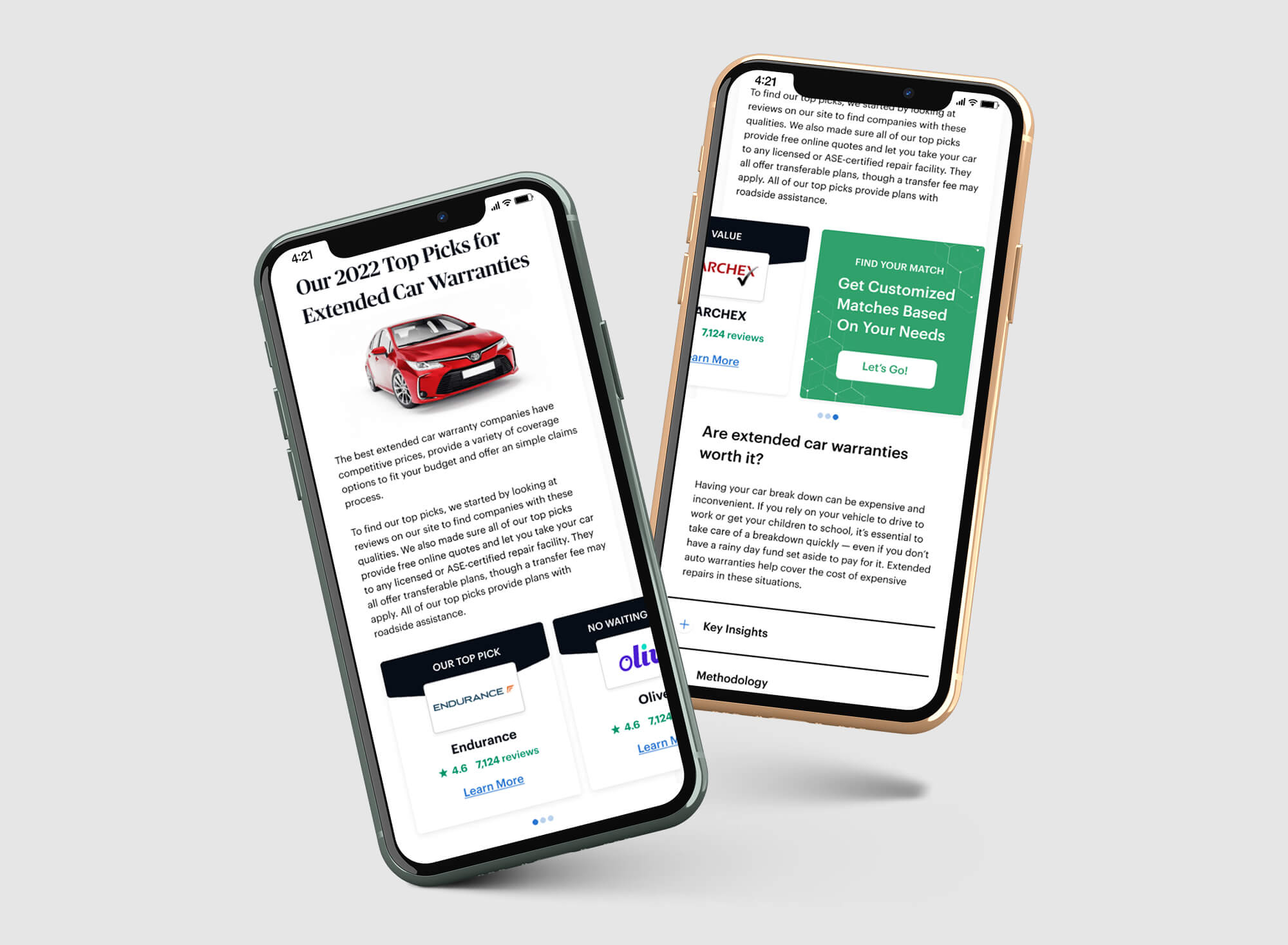
After the first two phases of changes, the template was started to perform better than before. However, I felt like we could do more from a mobile perspective. Since these Buyer's Guide templates housed a lot of content, mobile tended to be quite a long scroll and the data was proving that those templates needed to improve on scroll depth for mobile devices. To test this out, I designed out an option for the mobile experince that introduced a carousel styled section of the top brands. After an intial test of this new design, the scroll depth of users on people increased and they engaged more with the top brands in the new carousel section.