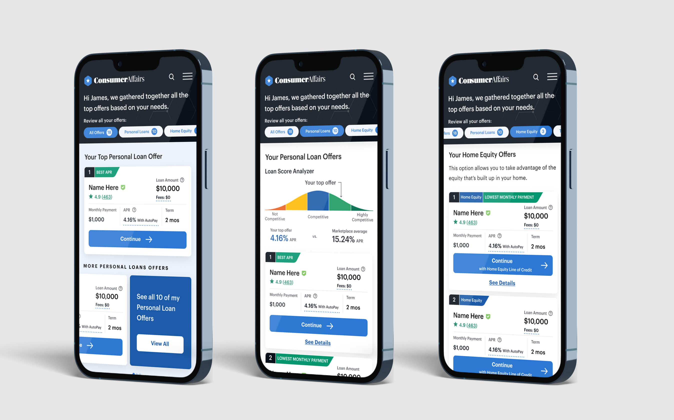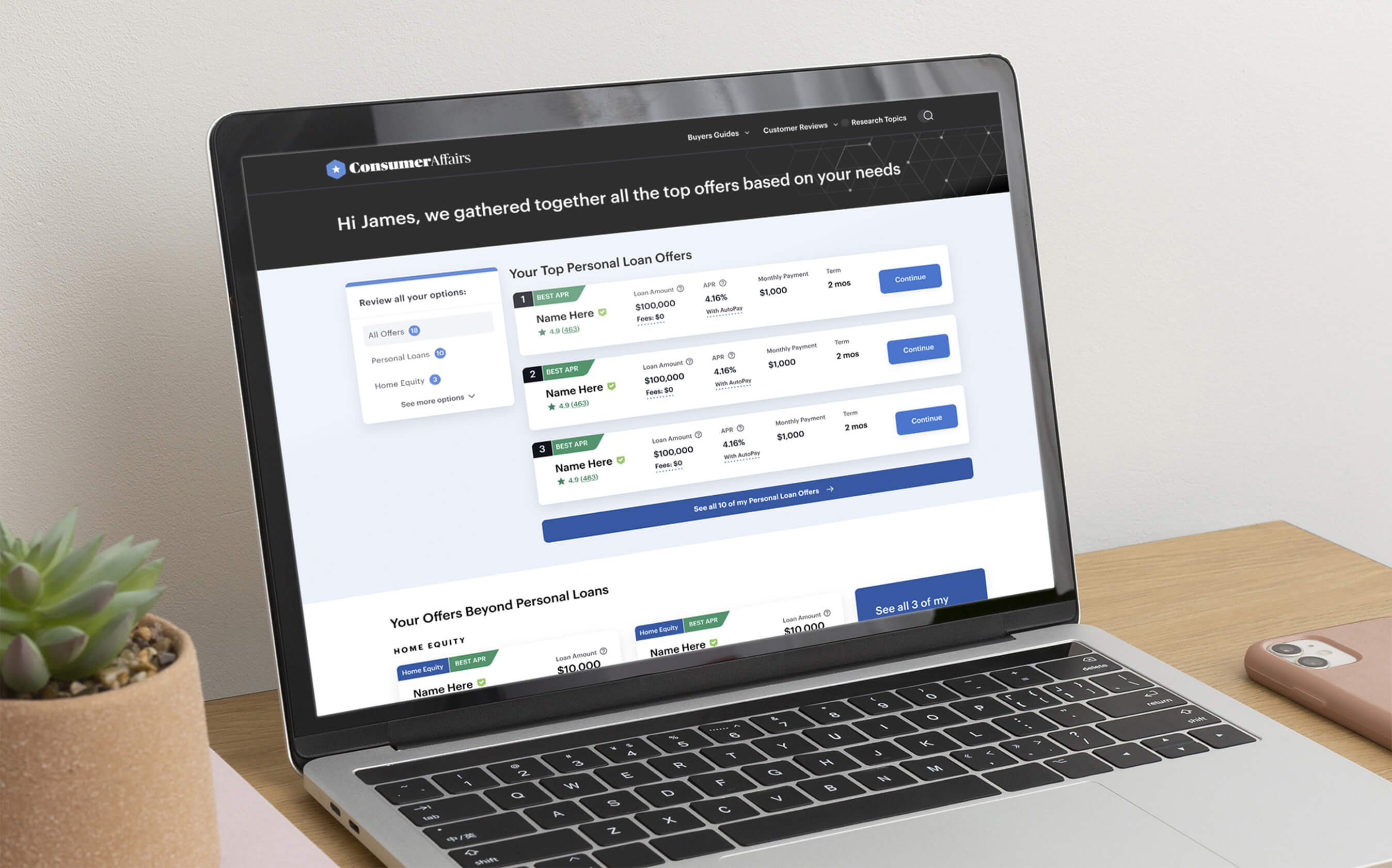

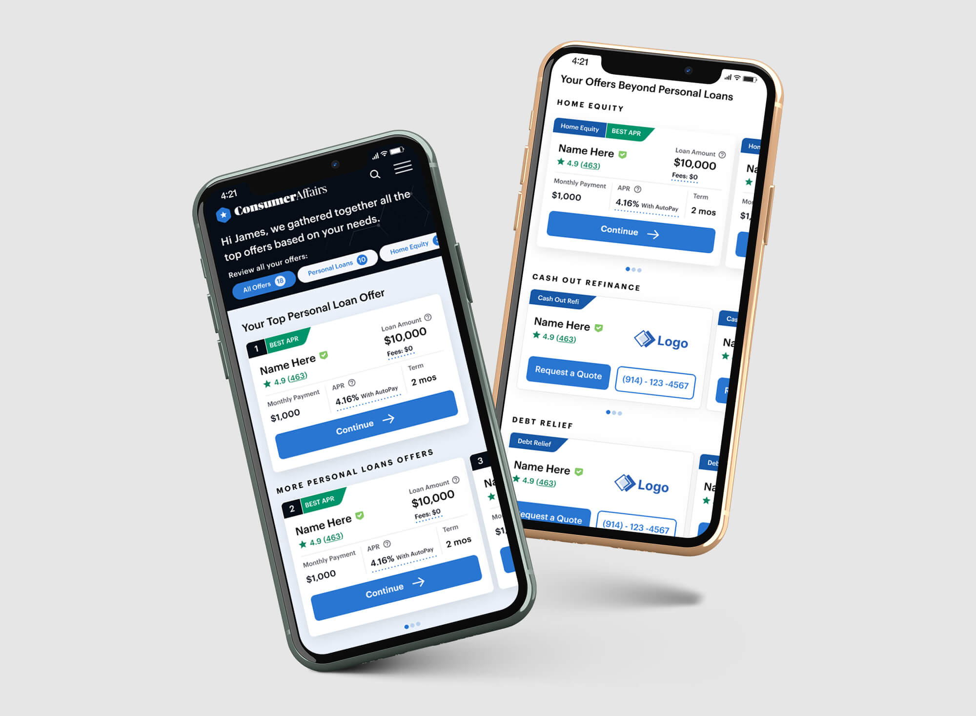
After the matching tool was built out, I thought it would be good to move onto the next phase of what the offers we were providing users through that tool could look like. At the time of building out the matching tool, the results pages were simpler and really only provided options for one specific topic when a secondary option could actually be a better fit for a user. For example, if a user was interested in getting a personal loan, based on the information they provided us, we could also present home equity options to them since it could be a good alternate option that they might not of considered. This offer dashboard adds extra options in the intial landing screen ("All Offers" tab) while still highlighting the main option the user was intestested in at the top.