

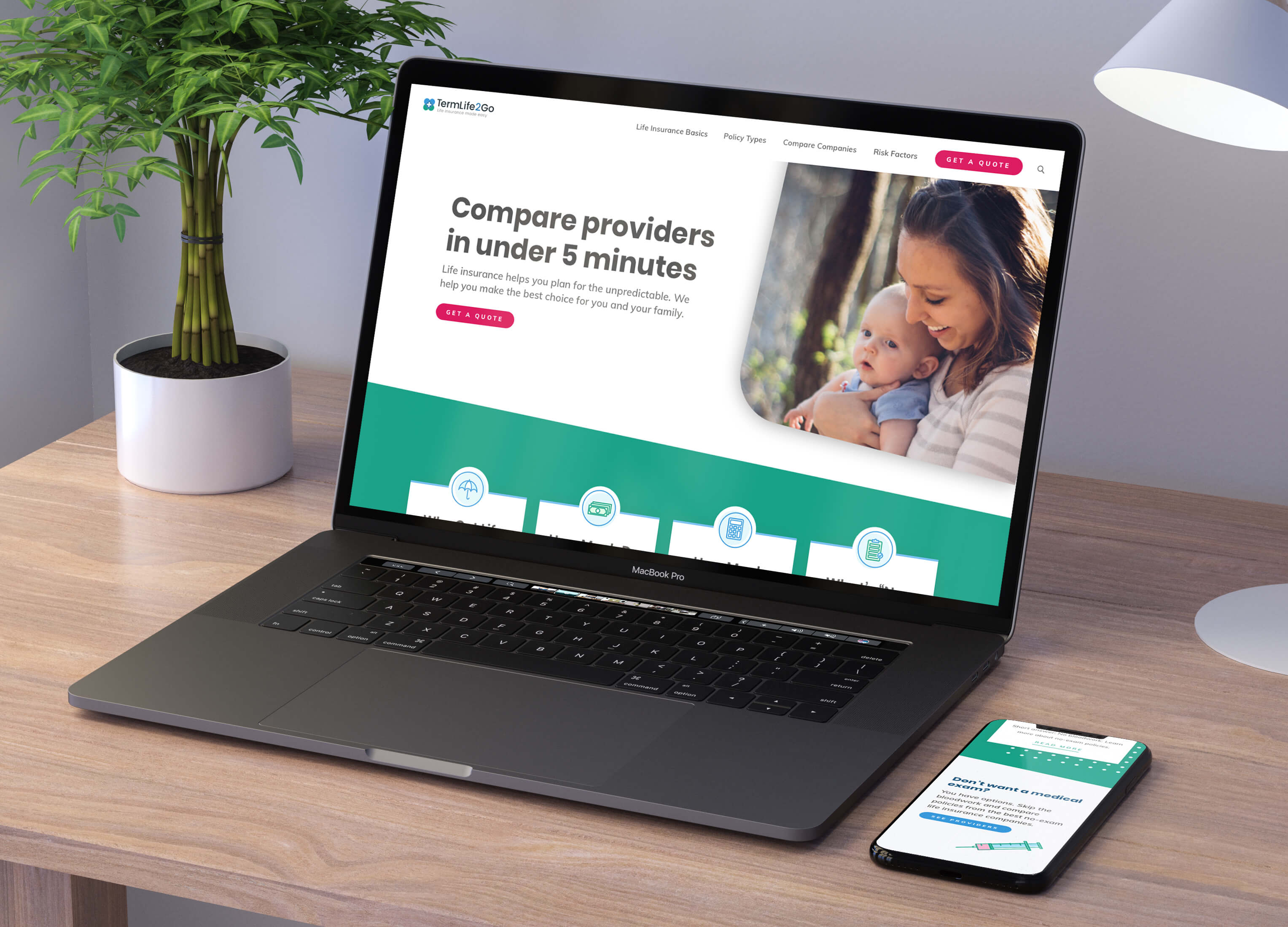
TermLife2Go is a one-stop-shop for all things life insurance. It started out as a convoluted and outdated website that was hard for users to find the informtion they were looking for quickly. After a branding refresh and a newly organized site architecture, it's now much easier find the answers you're looking for.
Purchasing life insurance can be a scary topic for some people. Not only that, but it can be complex and confusing. I wanted to bring in some fresh and calming colors in the rebranding of TermLife2Go. On top of the new color palette and monderized logo, I created custom illustrations and graphics to help make the elements of life insurance more visually understandable.
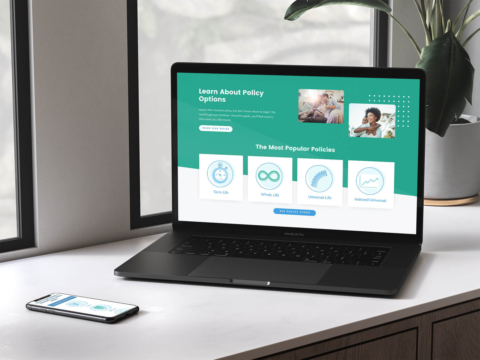
When it comes to life insurance, there are a number of different type of reasons people could be looking into it. For some people it's because they got married, had a kid, bought a house, have a dangerous job or hobby, and the list goes on. While thinking through these reasons, we realized we needed to make it easy to learn what kind of policies are available by browsing the site through an educational path.